The 15 Ugliest Ryder Cup Outfits In History

As far as blog posts go, this one was exceptionally interesting to research. For those who don't know, the Ryder Cup has a long and storied history that goes back to 1927. Virtually every important figure in golf from America or Europe has played in the Ryder Cup for the past 89 years and it's history provides us with an amazing treasure trove of stories, photographs and competition.
When I had the idea for this post, I was originally going to do a history of Ryder Cup fashion, but when I saw some of the incredibly ugly outfits from some of the teams, I knew that a ranking of the Ugliest Ryder Cup Outfits in History would be much more fun. Some interesting things to note:
1. Early Ryder Cup fashions were very solid. Perhaps it's because I was looking at these photos through the lens of history, but most of the ensembles from 1927 through the mid-60's were really fantastic-looking. It just so happens that those years also coincide with what many people think of as a "golden age" in men's fashion, but overwhelmingly, the tailored looks from the first 40 years of Ryder Cup play were excellent.
2. Some of these looks really haven't aged well. For the most part, Ryder Cup fashion and golf fashion in general has been pretty conservative throughout the years. And to be honest, those are the looks that have held up well. A lot of the looks that made this list are ones that were "trendy" at the time, but fell out of favor soon after.
3. These are my opinions. I am not a fashion critic, nor even a particularly fashionable person. This posts contains a list of what I consider to be the ugliest outfits in Ryder Cup history. These are my opinions. However, my opinions also happen to be correct, so you can probably just assume that this list is definitive. Enjoy!

15. Team USA 1991
As far as ugly Ryder Cup outfits go, this is not entirely terrible. I mean, it's definitely not good, but the worst you can say is that those jackets definitely have an early 90's Miami Vice feel. Or maybe that's just the beach in the background and all of the tousled wind-blown hair. On a related note, I was never able to find a full head to toe picture of this outfit and I for one, really hope that these guys are all barefoot on that beach.
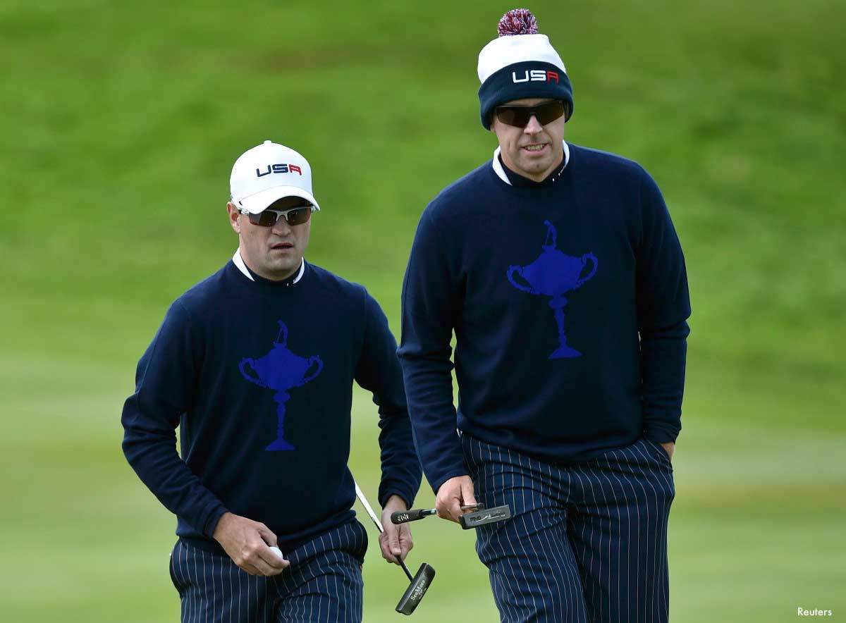
14. Team USA 2014
Oh USA, why did you have to wear these ugly, arrogant and self-aggrandizing sweaters. It's like you were asking for a complete meltdown in your normally-dominant final day singles matches. To be honest, this look isn't entirely bad, but as a U.S. Citizen and patriot, I am a firm believer that these trophy sweaters single-handedly caused the demise of the 2014 US Ryder Cup Team, which is why they earned the number 14 spot on this list. #justsaying
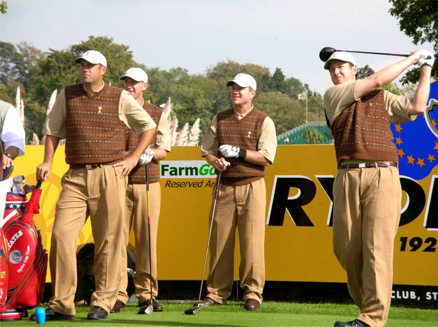
13. Team USA 2006
These lovely brown sweater vests worn by Team USA at the 2006 Ryder Cup are pretty much the definition of a "Cosby Sweater". You've got the pattern running across the vest, and you can tell that they really tried hard to tie the whole look together with those complimentary tan slacks. Maybe it's sweater vests in general or these specific vests, but the team honestly looked like a bunch of kindergartners on picture day.

12. Team Europe 2014
I'll be the first to admit that I don't always appreciate the more flashy styles of European golfers. The nuances of a skin-tight golf apparel will probably never really appeal to a simple Midwest gal like me. However, I don't think I'm stepping out of line here when I say that the purple/navy sweaters worn by the Europeans at the 2014 Ryder Cup were butt-ugly. Too tight and featuring a weird design, these sweaters should have been benched.

11. Team Europe 2014...again
I can absolutely appreciate someone who is adventurous enough to take a fashion risk. I can also appreciate drawing on the history of fashion to create a look that moves you forward while paying homage to the past. These atrocious plaid jackets worn by Team Europe in 2014 did neither and man were they ugly. Half the problem is that you've got so many guys in plaid in this shot that it just looks like some plaid monster barfed all over. However, the Ryder Cup is a team event and this team look just doesn't fly.

10. Team Europe 1995
Tell me honestly, because I'm a little on the young side to truly know. Is there anything more 80's than an oversize suit jacket? Everything from the cut of this jacket to the color to the baggy pants is all wrong. Maybe they were rehearsing for a Talking Heads video. That's really the only logical explanation as to why you would dress a Ryder Cup team like this.
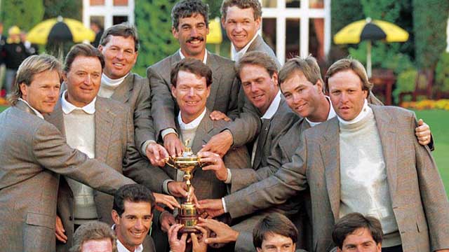
9. Team USA - 1993
USA - what are you doing with the trophy sweaters? They obviously didn't jinx the Americans in '93 like they did in 2014, but good Lord, this brown on tan on ivory color scheme is so vanilla and "golfy" that I can hardly stand it. And don't even get me started with the turtleneck/sweater combo. There is no justifiable reason for anyone to need that many layers around their neck. Just stop.

8. Team USA 1983
Oh boy, where do I start here? The first thing I'll call out are those lovely camel brown pants. I mean if there is a less flattering color in the world, please tell me because I really don't think there is. Secondly, I'm pretty sure that my mom had a set of pillows and curtains in our formal living room growing up that would coordinate perfectly with those salmon-y polos. And finally, I'm not sure who had the brilliant idea to tie camel brown pants and a salmon shirt together with a grey jacket, but kudos to you, because that's a combo that has never been seen before or never should be seen again. Nice work Team USA.

7. Team USA 1983...again
I'm just going to put this out there - 1983 was not the height of men's golf fashion. This blue plaid suit jacket and blue pants combo is really...something. Plaid jackets are just way too much when you've got 13 of them on one picture. Too bad the 2014 European Ryder Cup team didn't take a look at this shot before they tried to pull a repeat of this fashion flop. On the other hand, Curtis Strange's hair looks amazing, so there's that.
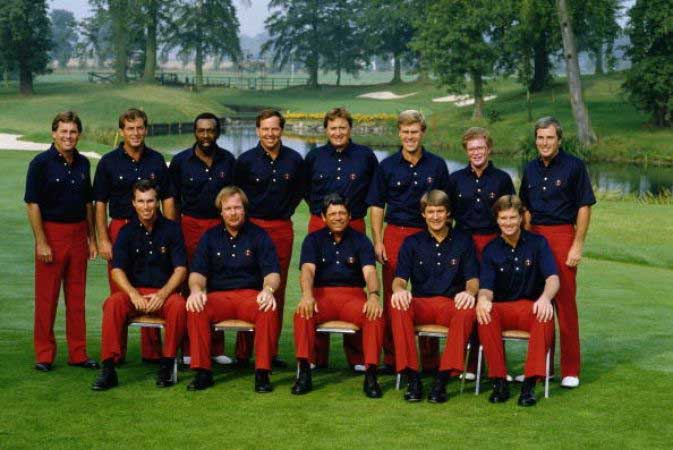
6. Team USA - 1985
When I first saw this picture, I would have put cold hard cash on the fact that this was from the 70's. Imagine my surprise when I found out that this amazing schoolboy uniform look was shown at the 1985 Ryder Cup! Those stunning rust-colored pants and 4-button placket on the navy shirt really help these guys look like a unified team of golf course superintendents.

5. Team Great Britain & Ireland 1973
I have to be honest. I have a real love/hate relationship with this look from the 1973 Ryder Cup. The jackets are actually pretty cool looking with the (I'm hoping black velvet) trimmed lapels. I'm pretty sure it's the funky print of the shirt underneath those suave sweaters that is throwing the whole thing off for me. So much potential here, but in the end this look, like an Italian guy with a blonde American girl, is just a little too forward and a little too European.

4. Team Great Britain 1969
I don't have any way to prove it, but I'm pretty sure that this is the most British picture ever taken. All it really needs is an English Bulldog and a Union Jack hanging in the background and I think even the Queen would acknowledge my assertion. Those insane hats make the 1969 British Ryder Cup Team look like a bunch of Bobbies...or a troupe of Vaudeville performers. What's crazy about this getup is that the core of the outfit - the pants, sweater and jacket - is really solid. It's the accessories that land this ensemble in the number four spot. From the baby blue socks (which coordinate with the sweater) to the black and white wing-tips to the jaunty cap, these guys look like they are gearing up for a local theater production rather than an intense golf match.
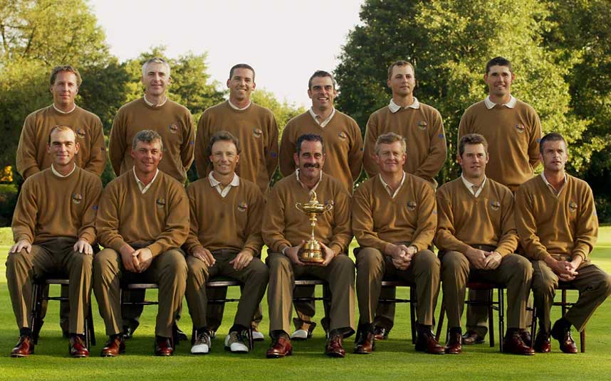
3. Team Europe 2002
Um Europe, I hate to tell you this because you must be so embarrassed, but I think someone threw up all over your 2002 Ryder Cup Uniforms. I mean there is just so. much. brown. That being said, the shoes look pretty snazzy and I enjoy the look of the sweater/slacks combo. Unfortunately, the colors for this outfit are so bad that you may want to just never wear this look again.

2. Team Europe 2006
Holy turtleneck Batman! This stunningly bad Ryder Cup look from the 2006 European team narrowly missed out on the number one spot but you could probably make a pretty strong case for it being the ugliest Ryder Cup outfit in history. I'm not quite sure who I should credit with coming up with the pink salmon colored suit jacket and white mock turtleneck look, but if you know the person, please tell them that based on this photo alone, their right to dress themselves or others has been revoked...forever. On a related note 2006 will go down in history as the year of the mock turtleneck. Thank you Tiger Woods for your most important contribution to the game of golf. #RIPmockturtleneck
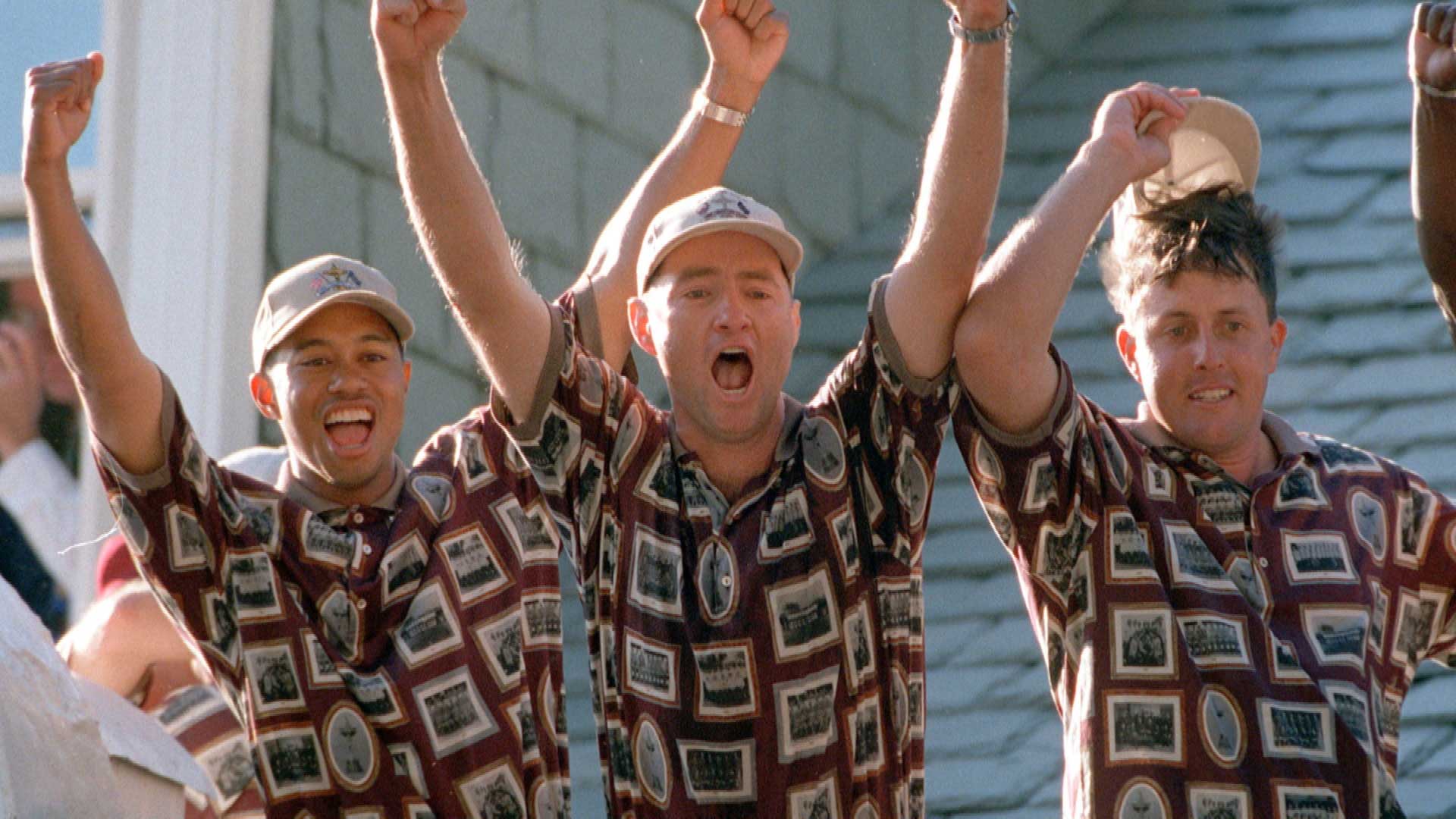
1. Team USA 1999
If you've been a fan of golf for any amount of time, the selection of Team USA's 1999 Ryder Cup Polo as the ugliest of all time should come as no surprise. These maroon-based polos with dozens of framed pictures were so bad that in a celebratory frenzy after Team USA came from behind to win, they burned them on the 18th green. Alright, that didn't actually happen...but it should have. Congratulations 1999 US Ryder Cup Team - your ugly shirts are the ultimate winners. Here's a couple more shots, just so you get the look really locked in your brain:


Don't get caught in a big moment with ugly clothes. Shop Austad's incredible selection of men's golf apparel anytime and get great looks at even better prices!
Want to stay up to date with all the latest stories, trends and gossip from the world of golf? Make sure you sign up for our Austad's Golf Insider Newsletter!


